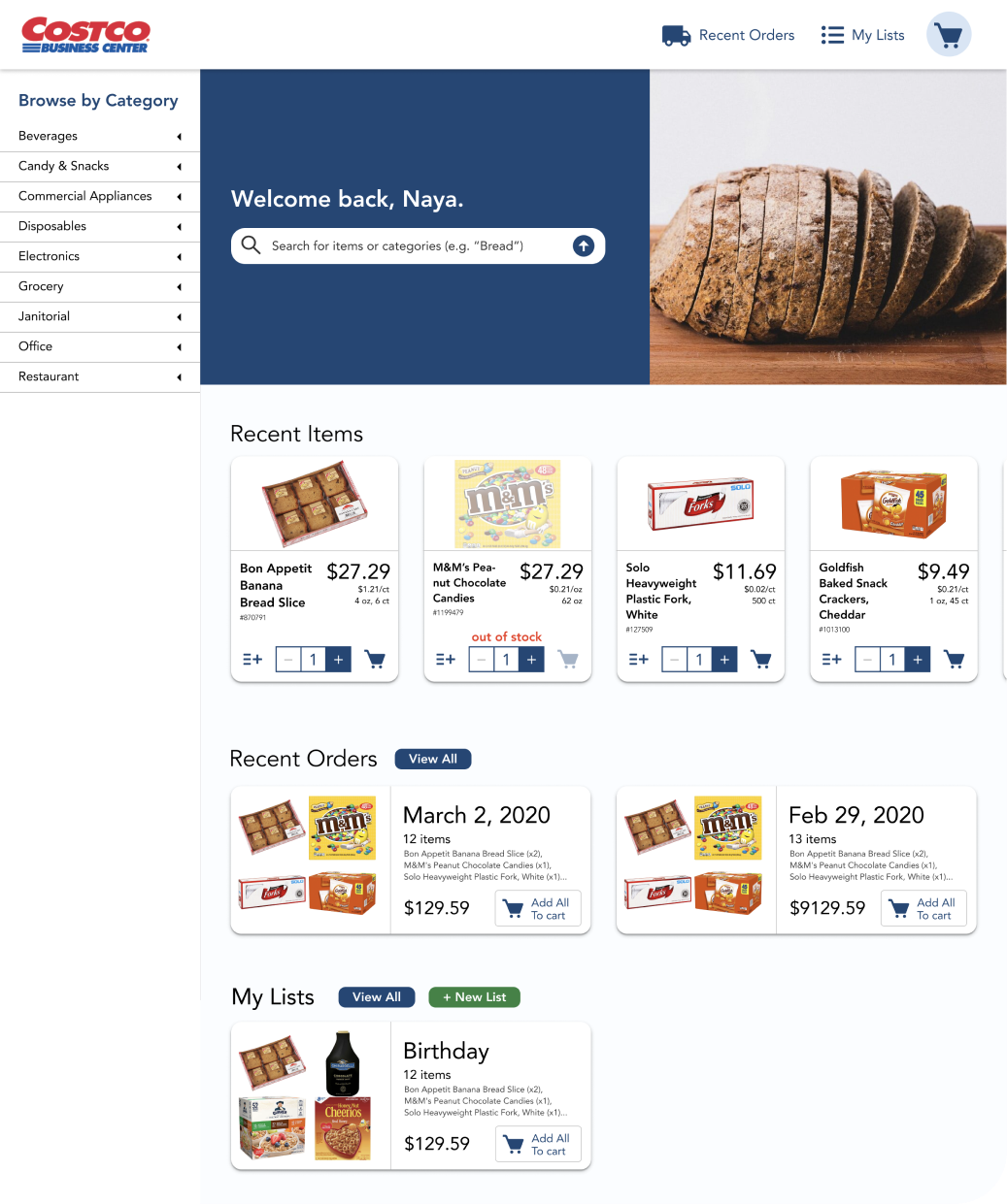
The main goal was to help Stanford kitchen managers more easily and efficiently order necessary items for their houses by addressing pain points and optimizing the user experience. (change)
As part of a Stanford course on need finding and design thinking, we were tasked with redesigning a service/website of our choosing. My team and I decided to explore the Costco BusinessCenter website,where both residentsand businesses withCostco membershipscan shop for a varietyof consumer productsin bulk.
We chose to focus on student kitchen managers at Stanford University, a lot of whom use Costco Business Center as their main shopping platform, as our target user persona. This enabled us to observe and analyse our users in person while they interacted with the tool, and later on our prototypes.
Our initial task analysis suggested that we look deeper into three areas where our users described a less convenient shopping experience, and all of which are recurring steps within the user’s interaction with the tool.
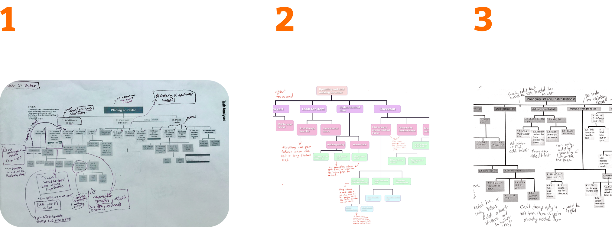
We wanted to zoom-in even further on one specific issue before we got to working. We drafted two different task analyses (concept A & concept B) that we paired with visual diagrams to better understand user behaviour and the impact on it resulting from different strategies.
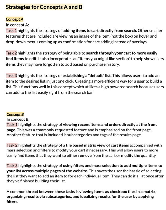
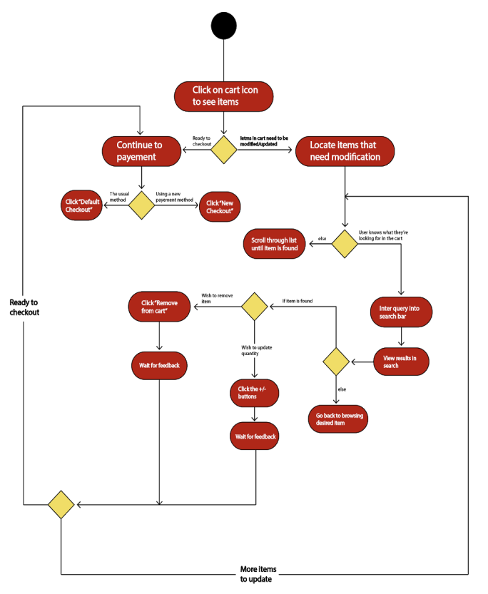
As our hypotheses evolved throughout the design process, we created relevant prototypes and tested them with actual users to gain feedback & validation on our hypotheses. We started out with quick sketch prototypes on paper and gradually transitioned to high-fidelity Figma wireframes and mockups.
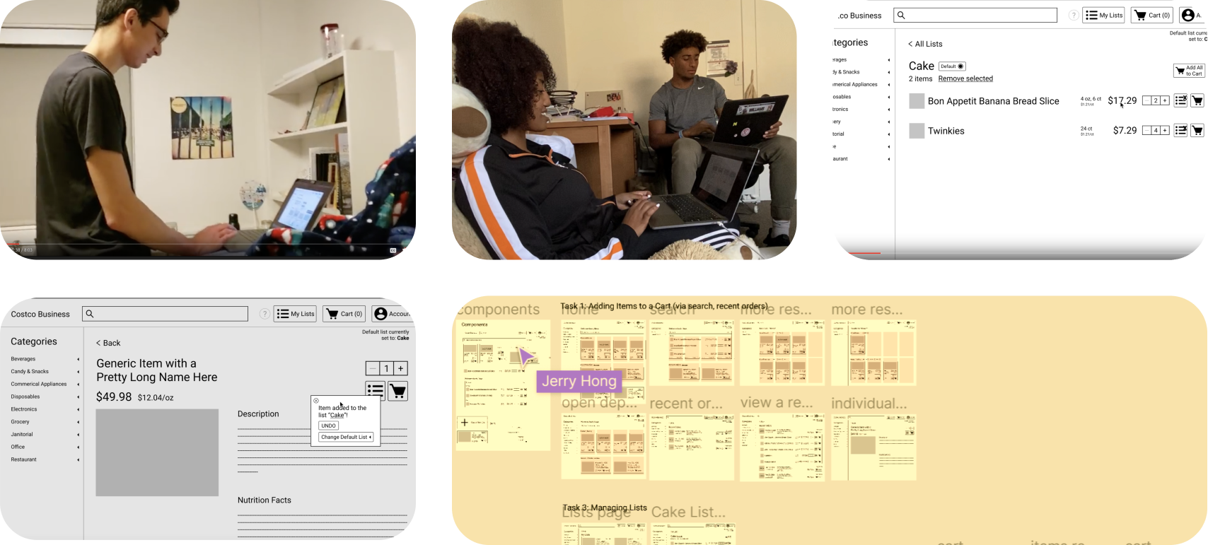
After analyzing the user feedback on our prototypes based on concepts A & B that we explored in our task analyses, it was clear that concept A was a more fit direction to continue with.
We repeated the process of prototyping, testing, & refining our final concept until we settled on a version that seemed to answer our users’ needs the best.
